Bonjour a tous,
Est ce que quelqu’un a ou sais comment avoir ce bouton on off sous jeedom ?
Merci d’avance
Bonjour a tous,
Est ce que quelqu’un a ou sais comment avoir ce bouton on off sous jeedom ?
Merci d’avance
Salut @antoine10
sympa ce petit bouton 
je vais le faire…
tu le partages asap ? 
Salut,
J’ai pris un peu d’avance sur @cstan77 mais beaucoup d’améliorations sont possibles :
Widget code action/default :
<div class="cmd cmd-widget cursor" data-type="action" data-subtype="other" data-template="neonSwitch" data-cmd_id="#id#" data-cmd_uid="#uid#" data-version="#version#" data-eqLogic_id="#eqLogic_id#">
  <div class="content">
    <span class="cmdName #hide_name#">#valueName#</span>
   <label class="switch execute">
  <input class="switch__input" type="checkbox" role="switch">
  <span class="switch__base-outer"></span>
  <span class="switch__base-inner"></span>
  <svg class="switch__base-neon" viewBox="0 0 40 24" width="40px" height="24px">
    <defs>
      <filter id="switch-glow#uid#">
        <feGaussianBlur result="coloredBlur" stddeviation="1"></feGaussianBlur>
        <feMerge>
          <feMergeNode in="coloredBlur"></feMergeNode>
          <feMergeNode in="SourceGraphic"></feMergeNode>
        </feMerge>
      </filter>
      <linearGradient id="switch-gradient1#uid#" x1="0" y1="0" x2="1" y2="0">
        <stop offset="0%" stop-color="hsl(var(--on-hue1),90%,70%)" />
        <stop offset="100%" stop-color="hsl(var(--on-hue2),90%,70%)" />
      </linearGradient>
      <linearGradient id="switch-gradient2#uid#" x1="0.7" y1="0" x2="0.3" y2="1">
        <stop offset="25%" stop-color="hsla(var(--on-hue1),90%,70%,0)" />
        <stop offset="50%" stop-color="hsla(var(--on-hue1),90%,70%,0.3)" />
        <stop offset="100%" stop-color="hsla(var(--on-hue2),90%,70%,0.3)" />
      </linearGradient>
    </defs>
    <path fill="none" filter="url(#switch-glow#uid#)" stroke="url(#switch-gradient1#uid#)" stroke-width="1" stroke-dasharray="0 104.26 0" stroke-dashoffset="0.01" stroke-linecap="round" d="m.5,12C.5,5.649,5.649.5,12,.5h16c6.351,0,11.5,5.149,11.5,11.5s-5.149,11.5-11.5,11.5H12C5.649,23.5.5,18.351.5,12Z"/>
  </svg>
  <span class="switch__knob-shadow"></span>
  <span class="switch__knob-container">
    <span class="switch__knob">
      <svg class="switch__knob-neon" viewBox="0 0 48 48" width="48px" height="48px">
        <circle fill="none" stroke="url(#switch-gradient2#uid#)" stroke-dasharray="0 90.32 0 54.19" stroke-linecap="round" stroke-width="1" r="23" cx="24" cy="24" transform="rotate(-112.5,24,24)" />
      </svg>
    </span>
  </span>
  <span class="switch__led"></span>
</label>
  </div>
  <div class="timeCmd label label-default #value_history#" data-type="info" data-cmd_id="#value_id#"></div>
  <script>
    document.querySelector('.cmd[data-cmd_uid=#uid#] .execute').addEventListener('click', function(event) {
      jeedom.cmd.execute({ id: '#id#' })
      event.stopPropagation()
    })

    jeedom.cmd.addUpdateFunction('#id#', function(_options) {
      if (is_object(cmd = document.querySelector('.cmd[data-cmd_uid="#uid#"]'))) {
        if ('#time#' == 'duration' || '#time#' == 'date') {
          jeedom.cmd.displayDuration(_options.valueDate, cmd.querySelector('.timeCmd'), '#time#')
        }

        if (_options.display_value >= 1 || _options.display_value == 'on') {
          if (jeedom.cmd.normalizeName('#name#') == 'on') {
            cmd.unseen()
          } else {
            cmd.seen()
            cmd.querySelector('input.switch__input').checked = true
          }
        } else {
          if (jeedom.cmd.normalizeName('#name#') == 'off') {
            cmd.unseen()
          } else {
            cmd.seen()
            cmd.querySelector('input.switch__input').checked = false
          }
        }

        if (cmd.querySelector('.cmdName').hasClass('hidden')) {
          cmd.querySelector('.content').style.justifyContent = 'center'
        }
      }
    })

    jeedom.cmd.refreshValue([{ cmd_id: '#id#', display_value: '#state#', valueDate: '#valueDate#', collectDate: '#collectDate#', alertLevel: '#alertLevel#', unit: '#unite#' }])
  </script>
   <style>
    :root {
  --hue: 223;
  --off-hue: 3;
  --on-hue1: 123;
  --on-hue2: 168;
  --fg: hsl(var(--hue),10%,90%);
  --primary: hsl(var(--hue),90%,50%);
  --trans-dur: 0.6s;
  --trans-timing: cubic-bezier(0.65,0,0.35,1);
  font-size: calc(40px + (60 - 40) * (100vw - 320px) / (2560 - 320));
}
.switch {
  display: block;
  margin: auto;
  position: relative;
  width: 5em;
  height: 3em;
}
.switch__base-outer,
.switch__base-inner {
  display: block;
  position: absolute;
}
.switch__base-outer {
  border-radius: 1.25em;
  box-shadow:
    -0.125em -0.125em 0.25em hsl(var(--hue),10%,30%),
    0.125em 0.125em 0.125em hsl(var(--hue),10%,30%) inset,
    0.125em 0.125em 0.25em hsl(0,0%,0%),
    -0.125em -0.125em 0.125em hsl(var(--hue),10%,5%) inset;
  top: 0.125em;
  left: 0.125em;
  width: 4.75em;
  height: 2.75em;
}
.switch__base-inner {
  border-radius: 1.125em;
  box-shadow:
    -0.25em -0.25em 0.25em hsl(var(--hue),10%,30%) inset,
    0.0625em 0.0625em 0.125em hsla(var(--hue),10%,30%),
    0.125em 0.25em 0.25em hsl(var(--hue),10%,5%) inset,
    -0.0625em -0.0625em 0.125em hsla(var(--hue),10%,5%);
  top: 0.375em;
  left: 0.375em;
  width: 4.25em;
  height: 2.25em;
}
.switch__base-neon {
  display: block;
  overflow: visible;
  position: absolute;
  top: 0;
  left: 0;
  width: 100%;
  height: auto;
}
.switch__base-neon path {
  stroke-dasharray: 0 104.26 0;
  transition: stroke-dasharray var(--trans-dur) var(--trans-timing);
}
.switch__input {
  outline: transparent;
  position: relative;
  width: 100%;
  height: 100%;
  display: none!important;
  -webkit-appearance: none;
  appearance: none;
}
.switch__input:before {
  border-radius: 0.125em;
  box-shadow: 0 0 0 0.125em hsla(var(--hue),90%,50%,0);
  content: "";
  display: block;
  position: absolute;
  inset: -0.125em;
  transition: box-shadow 0.15s linear;
}
.switch__input:focus-visible:before {
  box-shadow: 0 0 0 0.125em var(--primary);
}
.switch__knob,
.switch__knob-container {
  border-radius: 1em;
  display: block;
  position: absolute;
}
.switch__knob {
  background-color: hsl(var(--hue),10%,15%);
  background-image:
    radial-gradient(88% 88% at 50% 50%,hsl(var(--hue),10%,20%) 47%,hsla(var(--hue),10%,20%,0) 50%),
    radial-gradient(88% 88% at 47% 47%,hsl(var(--hue),10%,85%) 45%,hsla(var(--hue),10%,85%,0) 50%),
    radial-gradient(65% 70% at 40% 60%,hsl(var(--hue),10%,20%) 46%,hsla(var(--hue),10%,20%,0) 50%);
  box-shadow:
    -0.0625em -0.0625em 0.0625em hsl(var(--hue),10%,15%) inset,
    -0.125em -0.125em 0.0625em hsl(var(--hue),10%,5%) inset,
    0.75em 0.25em 0.125em hsla(0,0%,0%,0.8);
  width: 2em;
  height: 2em;
  transition: transform var(--trans-dur) var(--trans-timing);
}
.switch__knob-container {
  overflow: hidden;
  top: 0.5em;
  left: 0.5em;
  width: 4em;
  height: 2em;
}
.switch__knob-neon {
  display: block;
  width: 2em;
  height: auto;
}
.switch__knob-neon circle {
  opacity: 0;
  stroke-dasharray: 0 90.32 0 54.19;
  transition:
    opacity var(--trans-dur) steps(1,end),
    stroke-dasharray var(--trans-dur) var(--trans-timing);
}
.switch__knob-shadow {
  border-radius: 50%;
  box-shadow: 0.125em 0.125em 0.125em hsla(0,0%,0%,0.9);
  display: block;
  position: absolute;
  top: 0.5em;
  left: 0.5em;
  width: 2em;
  height: 2em;
  transition: transform var(--trans-dur) var(--trans-timing);
}
.switch__led {
  background-color: hsl(var(--off-hue),90%,70%);
  border-radius: 50%;
  box-shadow:
    0 -0.0625em 0.0625em hsl(var(--off-hue),90%,40%) inset,
    0 0 0.125em hsla(var(--off-hue),90%,70%,0.3),
    0 0 0.125em hsla(var(--off-hue),90%,70%,0.3),
    0.125em 0.125em 0.125em hsla(0,0%,0%,0.5);
  display: block;
  position: absolute;
  top: 0;
  left: 0;
  width: 0.25em;
  height: 0.25em;
  transition:
    background-color var(--trans-dur) var(--trans-timing),
    box-shadow var(--trans-dur) var(--trans-timing);
}
.switch__text {
  overflow: hidden;
  position: absolute;
  width: 1px;
  height: 1px;
}
.switch__input:checked ~ .switch__led {
  background-color: hsl(var(--on-hue1),90%,70%);
  box-shadow:
    0 -0.0625em 0.0625em hsl(var(--on-hue1),90%,40%) inset,
    0 -0.125em 0.125em hsla(var(--on-hue1),90%,70%,0.3),
    0 0.125em 0.125em hsla(var(--on-hue1),90%,70%,0.3),
    0.125em 0.125em 0.125em hsla(0,0%,0%,0.5);
}
.switch__input:checked ~ .switch__base-neon path {
  stroke-dasharray: 52.13 0 52.13;
}
.switch__input:checked ~ .switch__knob-shadow,
.switch__input:checked ~ .switch__knob-container .switch__knob {
  transform: translateX(100%);
}
.switch__input:checked ~ .switch__knob-container .switch__knob-neon circle {
  opacity: 1;
  stroke-dasharray: 45.16 0 45.16 54.19;
  transition-timing-function: steps(1,start), var(--trans-timing);
}
  </style>
</div>
Bonjour Salviaf,
as tu également pensé à réaliser ce bouton en modèle à 3 ou 4 postions ?
Hello,
Ça te manquait les widgets ? 
C’est la gif animée où tu perds l’anim du slide dans le widget ? Pas trop regardé le code, mais tu as conservé tout le css d’origine pourtant ?
Coucou,
Oui j’ai perdu l’animation au passage, j’ai pas creusé juste écrit le widget rapidement effectivement ça me manquait un peu 
Wouhaaa, celui du haut avec l’animation est tout à la fois magnifique et sobre => j’adore 
Si quelqu’un sait reproduire l’animation, ça m’intéresse aussi.
Allez Salvialf, vu ce dont tu es capable d’habitude, tu vas bien y arriver
Mais c’est qu’ils sont exigeants 
J’ai corrigé le code c’était pas grand chose, est-ce mieux ainsi ?
Magnifique
Merci 
Parfait, comme d’hab, plus qu’à ajouter des paramètres 
Pour info, dans le même style (et avec animation aussi  ) :
) :
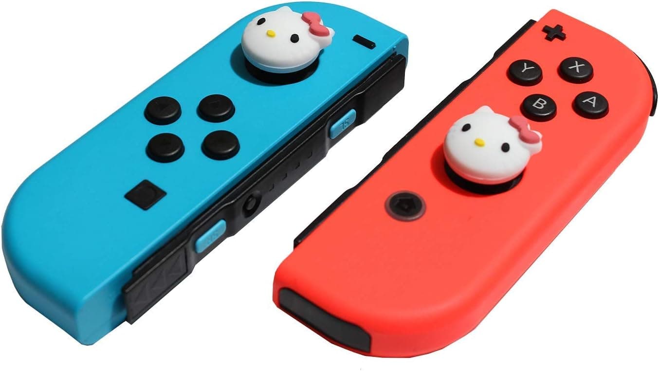
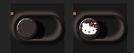
Moi je voudrais en rouge avec un bouton en forme de chaton, c’est possible?
Tout est possible mon cher, plusieurs positions aussi j’imagine ?! Tiens je t’ai même fait un bleu au passage c’est cadeau :
Presque pareil que ton image 

<div class="cmd cmd-widget cursor" data-type="action" data-subtype="other" data-template="neonSwitch" data-cmd_id="#id#" data-cmd_uid="#uid#" data-version="#version#" data-eqLogic_id="#eqLogic_id#">
<template>
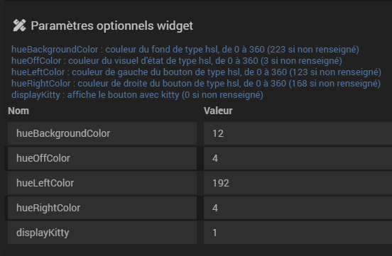
<div>hueBackgroundColor : couleur du fond de type hsl, de 0 à 360 (223 si non renseigné)</div>
<div>hueOffColor : couleur du visuel d'état de type hsl, de 0 à 360 (3 si non renseigné)</div>
<div>hueLeftColor : couleur de gauche du bouton de type hsl, de 0 à 360 (123 si non renseigné)</div>
<div>hueRightColor : couleur de droite du bouton de type hsl, de 0 à 360 (168 si non renseigné)</div>
<div>displayKitty : affiche le bouton avec kitty (0 si non renseigné)</div>
</template>
<div class="content">
<span class="cmdName #hide_name#">#valueName#</span>
<label class="switch execute">
<input class="switch__input" type="checkbox" role="switch">
<span class="switch__base-outer"></span>
<span class="switch__base-inner"></span>
<svg class="switch__base-neon" viewBox="0 0 40 24" width="40px" height="24px">
<defs>
<filter id="switch-glow#uid#">
<feGaussianBlur result="coloredBlur" stddeviation="1"></feGaussianBlur>
<feMerge>
<feMergeNode in="coloredBlur"></feMergeNode>
<feMergeNode in="SourceGraphic"></feMergeNode>
</feMerge>
</filter>
<linearGradient id="switch-gradient1#uid#" x1="0" y1="0" x2="1" y2="0">
<stop offset="0%" stop-color="hsl(var(--on-hue1#id#),90%,70%)" />
<stop offset="100%" stop-color="hsl(var(--on-hue2#id#),90%,70%)" />
</linearGradient>
<linearGradient id="switch-gradient2#uid#" x1="0.7" y1="0" x2="0.3" y2="1">
<stop offset="25%" stop-color="hsla(var(--on-hue1#id#),90%,70%,0)" />
<stop offset="50%" stop-color="hsla(var(--on-hue1#id#),90%,70%,0.3)" />
<stop offset="100%" stop-color="hsla(var(--on-hue2#id#),90%,70%,0.3)" />
</linearGradient>
</defs>
<path fill="none" filter="url(#switch-glow#uid#)" stroke="url(#switch-gradient1#uid#)" stroke-width="1" stroke-dasharray="0 104.26 0" stroke-dashoffset="0.01" stroke-linecap="round" d="m.5,12C.5,5.649,5.649.5,12,.5h16c6.351,0,11.5,5.149,11.5,11.5s-5.149,11.5-11.5,11.5H12C5.649,23.5.5,18.351.5,12Z"/>
</svg>
<span class="switch__knob-shadow"></span>
<span class="switch__knob-container">
<span class="switch__knob">
<svg class="switch__knob-neon" viewBox="0 0 48 48" width="48px" height="48px">
<circle fill="none" stroke="url(#switch-gradient2#uid#)" stroke-dasharray="0 90.32 0 54.19" stroke-linecap="round" stroke-width="1" r="23" cx="24" cy="24" transform="rotate(-112.5,24,24)" />
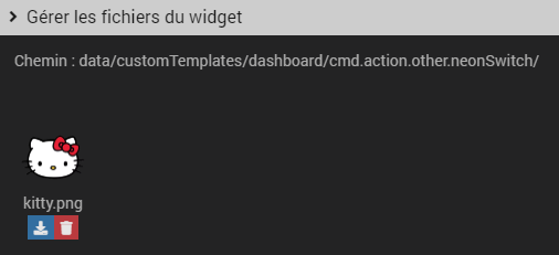
<image x="1" y="1" width="46" height="46" xlink:href="data/customTemplates/dashboard/cmd.action.other.neonSwitch/kitty.png" />
</svg>
</span>
</span>
<span class="switch__led#id#"></span>
</label>
</div>
<div class="timeCmd label label-default #value_history#" data-type="info" data-cmd_id="#value_id#"></div>
<script>
// parameters
var hueBackgroundColor#id# = ($.isNumeric('#hueBackgroundColor#')) ? parseFloat('#hueBackgroundColor#') : 223;
var hueOffColor#id# = ($.isNumeric('#hueOffColor#')) ? parseFloat('#hueOffColor#') : 3;
var hueLeftColor#id# = ($.isNumeric('#hueLeftColor#')) ? parseFloat('#hueLeftColor#') : 123;
var hueRightColor#id# = ($.isNumeric('#hueRightColor#')) ? parseFloat('#hueRightColor#') : 168;
var displayKitty#id# = ($.isNumeric('#displayKitty#')) ? parseFloat('#displayKitty#') : 0;
document.documentElement.style.setProperty('--hue#id#', hueBackgroundColor#id#)
document.documentElement.style.setProperty('--off-hue#id#', hueOffColor#id#)
document.documentElement.style.setProperty('--on-hue1#id#', hueLeftColor#id#)
document.documentElement.style.setProperty('--on-hue2#id#', hueRightColor#id#)
document.querySelector('.cmd[data-cmd_uid="#uid#"] .switch__knob-neon image').style.display = (displayKitty#id# == 0) ? 'none':'block';
document.querySelector('.cmd[data-cmd_uid=#uid#] .execute').addEventListener('click', function(event) {
jeedom.cmd.execute({ id: '#id#' })
event.stopPropagation()
})
jeedom.cmd.addUpdateFunction('#id#', function(_options) {
if (is_object(cmd = document.querySelector('.cmd[data-cmd_uid="#uid#"]'))) {
if ('#time#' == 'duration' || '#time#' == 'date') {
jeedom.cmd.displayDuration(_options.valueDate, cmd.querySelector('.timeCmd'), '#time#')
}
if (_options.display_value >= 1 || _options.display_value == 'on') {
if (jeedom.cmd.normalizeName('#name#') == 'on') {
cmd.unseen()
} else {
cmd.seen()
cmd.querySelector('input.switch__input').checked = true
}
} else {
if (jeedom.cmd.normalizeName('#name#') == 'off') {
cmd.unseen()
} else {
cmd.seen()
cmd.querySelector('input.switch__input').checked = false
}
}
if (cmd.querySelector('.cmdName').hasClass('hidden')) {
cmd.querySelector('.content').style.justifyContent = 'center'
}
}
})
jeedom.cmd.refreshValue([{ cmd_id: '#id#', display_value: '#state#', valueDate: '#valueDate#', collectDate: '#collectDate#', alertLevel: '#alertLevel#', unit: '#unite#' }])
</script>
<style>
:root {
--hue#id#: 223;
--off-hue#id#: 3;
--on-hue1#id#: 123;
--on-hue2#id#: 168;
--fg: hsl(var(--hue#id#),10%,90%);
--primary: hsl(var(--hue#id#),90%,50%);
--trans-dur: 0.6s;
--trans-timing: cubic-bezier(0.65,0,0.35,1);
font-size: calc(40px + (60 - 40) * (100vw - 320px) / (2560 - 320));
}
.switch {
display: block;
margin: auto;
position: relative;
width: 5em;
height: 3em;
}
.switch__base-outer,
.switch__base-inner {
display: block;
position: absolute;
}
.switch__base-outer {
border-radius: 1.25em;
box-shadow:
-0.125em -0.125em 0.25em hsl(var(--hue#id#),10%,30%),
0.125em 0.125em 0.125em hsl(var(--hue#id#),10%,30%) inset,
0.125em 0.125em 0.25em hsl(0,0%,0%),
-0.125em -0.125em 0.125em hsl(var(--hue#id#),10%,5%) inset;
top: 0.125em;
left: 0.125em;
width: 4.75em;
height: 2.75em;
}
.switch__base-inner {
border-radius: 1.125em;
box-shadow:
-0.25em -0.25em 0.25em hsl(var(--hue#id#),10%,30%) inset,
0.0625em 0.0625em 0.125em hsla(var(--hue#id#),10%,30%),
0.125em 0.25em 0.25em hsl(var(--hue#id#),10%,5%) inset,
-0.0625em -0.0625em 0.125em hsla(var(--hue#id#),10%,5%);
top: 0.375em;
left: 0.375em;
width: 4.25em;
height: 2.25em;
}
.switch__base-neon {
display: block;
overflow: visible;
position: absolute;
top: 0;
left: 0;
width: 100%;
height: auto;
}
.switch__base-neon path {
stroke-dasharray: 0 104.26 0;
transition: stroke-dasharray var(--trans-dur) var(--trans-timing);
}
.switch__input {
outline: transparent;
position: relative;
width: 100%;
height: 100%;
display: none!important;
-webkit-appearance: none;
appearance: none;
}
.switch__input:before {
border-radius: 0.125em;
box-shadow: 0 0 0 0.125em hsla(var(--hue#id#),90%,50%,0);
content: "";
display: block;
position: absolute;
inset: -0.125em;
transition: box-shadow 0.15s linear;
}
.switch__input:focus-visible:before {
box-shadow: 0 0 0 0.125em var(--primary);
}
.switch__knob,
.switch__knob-container {
border-radius: 1em;
display: block;
position: absolute;
}
.switch__knob {
background-color: hsl(var(--hue#id#),10%,15%);
background-image:
radial-gradient(88% 88% at 50% 50%,hsl(var(--hue#id#),10%,20%) 47%,hsla(var(--hue#id#),10%,20%,0) 50%),
radial-gradient(88% 88% at 47% 47%,hsl(var(--hue#id#),10%,85%) 45%,hsla(var(--hue#id#),10%,85%,0) 50%),
radial-gradient(65% 70% at 40% 60%,hsl(var(--hue#id#),10%,20%) 46%,hsla(var(--hue#id#),10%,20%,0) 50%);
box-shadow:
-0.0625em -0.0625em 0.0625em hsl(var(--hue#id#),10%,15%) inset,
-0.125em -0.125em 0.0625em hsl(var(--hue#id#),10%,5%) inset,
0.75em 0.25em 0.125em hsla(0,0%,0%,0.8);
width: 2em;
height: 2em;
transition: transform var(--trans-dur) var(--trans-timing);
}
.switch__knob-container {
overflow: hidden;
top: 0.5em;
left: 0.5em;
width: 4em;
height: 2em;
}
.switch__knob-neon {
display: block;
width: 2em;
height: auto;
}
.switch__knob-neon circle {
opacity: 0;
stroke-dasharray: 0 90.32 0 54.19;
transition:
opacity var(--trans-dur) steps(1,end),
stroke-dasharray var(--trans-dur) var(--trans-timing);
}
.switch__knob-neon image {
display: none;
}
.switch__knob-shadow {
border-radius: 50%;
box-shadow: 0.125em 0.125em 0.125em hsla(0,0%,0%,0.9);
display: block;
position: absolute;
top: 0.5em;
left: 0.5em;
width: 2em;
height: 2em;
transition: transform var(--trans-dur) var(--trans-timing);
}
.switch__led#id# {
background-color: hsl(var(--off-hue#id#),90%,70%);
border-radius: 50%;
box-shadow:
0 -0.0625em 0.0625em hsl(var(--off-hue#id#),90%,40%) inset,
0 0 0.125em hsla(var(--off-hue#id#),90%,70%,0.3),
0 0 0.125em hsla(var(--off-hue#id#),90%,70%,0.3),
0.125em 0.125em 0.125em hsla(0,0%,0%,0.5);
display: block;
position: absolute;
top: 0;
left: 0;
width: 0.25em;
height: 0.25em;
transition:
background-color var(--trans-dur) var(--trans-timing),
box-shadow var(--trans-dur) var(--trans-timing);
}
.switch__text {
overflow: hidden;
position: absolute;
width: 1px;
height: 1px;
}
.switch__input:checked ~ .switch__led#id# {
background-color: hsl(var(--on-hue1#id#),90%,70%);
box-shadow:
0 -0.0625em 0.0625em hsl(var(--on-hue1#id#),90%,40%) inset,
0 -0.125em 0.125em hsla(var(--on-hue1#id#),90%,70%,0.3),
0 0.125em 0.125em hsla(var(--on-hue1#id#),90%,70%,0.3),
0.125em 0.125em 0.125em hsla(0,0%,0%,0.5);
}
.switch__input:checked ~ .switch__base-neon path {
stroke-dasharray: 52.13 0 52.13;
}
.switch__input:checked ~ .switch__knob-shadow,
.switch__input:checked ~ .switch__knob-container .switch__knob {
transform: translateX(100%);
}
.switch__input:checked ~ .switch__knob-container .switch__knob-neon circle {
opacity: 1;
stroke-dasharray: 45.16 0 45.16 54.19;
transition-timing-function: steps(1,start), var(--trans-timing);
}
</style>
</div>
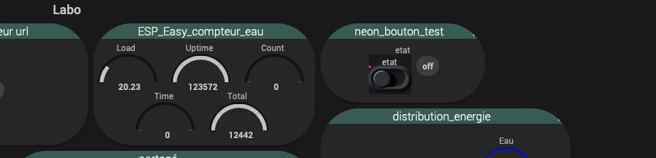
super votre taf merci !
mais des que j’applique ce widget sur la commande toutes mes tuiles passent en arrondi x)
normal ? effet de bord ?
C’est vague « en arrondi », difficile de répondre 
Mais de base, je dirais pas normal 
Sans appliquer le widget aux commandes :
En appliquant le widget sur une seule commande :
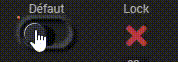
et j’ai une erreur :
37 TypeError: cmd.seen is not a function. (In 'cmd.seen()', 'cmd.seen' is undefined)des que je désactive le virtuel les tuiles redeviennent « comme avant »
Avec quel code ? Les deux provoquent cet affichage ? Je ne reproduis pas.
J’ai reproduit le soucis, avec le deuxième code pour ma part