Helloo,
Je vous propose un tuto pour pouvoir modifier l’animation d’attente de Jeedom.
L’installation nécessite les étapes suivantes :
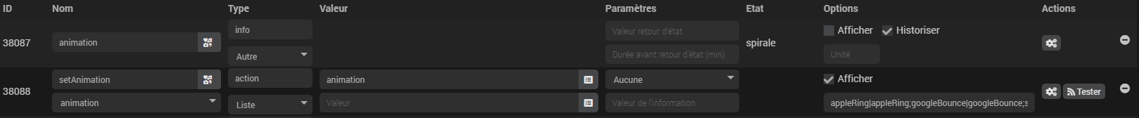
 Créer un virtuel avec une commande
 animation de type info / Autre et une commande action associée setAnimation de type action / Liste
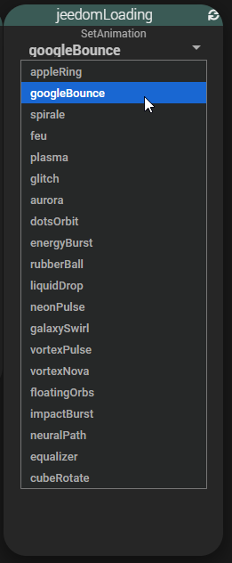
- Ajouter la liste suivante des animations disponibles au niveau de la commande action comme sur la capture :
appleRing|appleRing;googleBounce|googleBounce;spirale|spirale;feu|feu;plasma|plasma;glitch|glitch;aurora|aurora;dotsOrbit|dotsOrbit;energyBurst|energyBurst;rubberBall|rubberBall;liquidDrop|liquidDrop;neonPulse|neonPulse;galaxySwirl|galaxySwirl;vortexPulse|vortexPulse;vortexNova|vortexNova;floatingOrbs|floatingOrbs;impactBurst|impactBurst;neuralPath|neuralPath;equalizer|equalizer;cubeRotate|cubeRotate;blueSpinner|blueSpinner;jeedomLogo|jeedomLogo;ballsRotation|ballsRotation;jeedomHolo|jeedomHolo
 Sélectionner le menu
 Personnalisation avancée
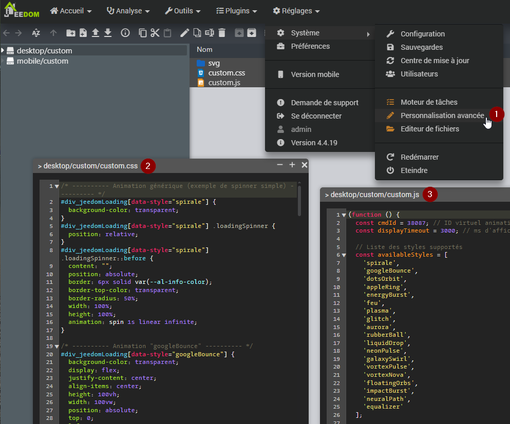
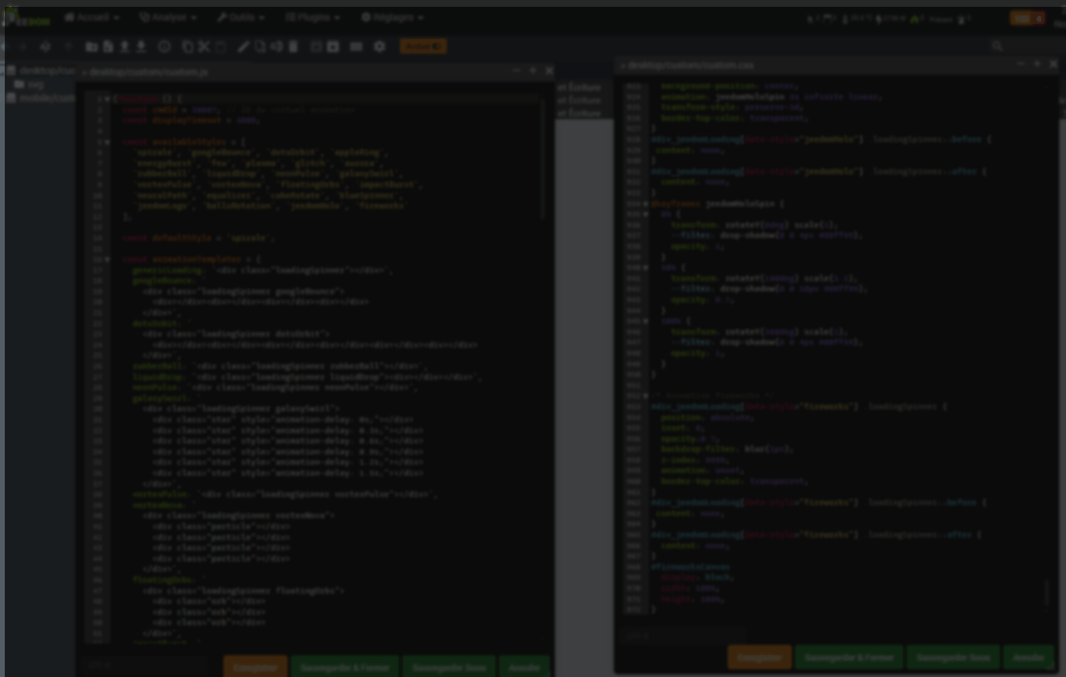
 Editer et ajouter le code suivant dans le fichier
 custom.css
custom.css
/* ---------- Animation générique (exemple de spinner simple) ---------- */
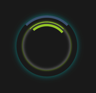
#div_jeedomLoading[data-style="spirale"] {
background-color: transparent;
}
#div_jeedomLoading[data-style="spirale"] .loadingSpinner {
position: relative;
}
#div_jeedomLoading[data-style="spirale"] .loadingSpinner::before {
content: "";
position: absolute;
border: 6px solid var(--al-info-color);
border-top-color: transparent;
border-radius: 50%;
width: 100%;
height: 100%;
animation: spin 1s linear infinite;
}
/* ---------- Animation "googleBounce" ---------- */
#div_jeedomLoading[data-style="googleBounce"] {
background-color: transparent;
display: flex;
justify-content: center;
align-items: center;
height: 100vh;
width: 100vw;
position: absolute;
top: 0;
left: 0;
z-index: 9999;
}
#div_jeedomLoading[data-style="googleBounce"] .loadingSpinner {
position: absolute;
display: flex;
justify-content: center;
align-items: center;
}
#div_jeedomLoading[data-style="googleBounce"] .loadingSpinner div {
position: absolute;
width: 20%;
height: 20%;
border-radius: 50%;
background-color: var(--logo-primary-color);
animation: bounce 1.5s infinite ease-in-out;
}
#div_jeedomLoading[data-style="googleBounce"] .loadingSpinner div:nth-child(1) {
top: 0;
left: 50%;
transform: translateX(-50%);
animation-delay: 0s;
background-color: #4285F4; /* bleu Google */
}
#div_jeedomLoading[data-style="googleBounce"] .loadingSpinner div:nth-child(2) {
top: 50%;
right: 0;
transform: translateY(-50%);
animation-delay: 0.3s;
background-color: #EA4335; /* rouge Google */
}
#div_jeedomLoading[data-style="googleBounce"] .loadingSpinner div:nth-child(3) {
bottom: 0;
left: 50%;
transform: translateX(-50%);
animation-delay: 0.6s;
background-color: #FBBC05; /* jaune Google */
}
#div_jeedomLoading[data-style="googleBounce"] .loadingSpinner div:nth-child(4) {
top: 50%;
left: 0;
transform: translateY(-50%);
animation-delay: 0.9s;
background-color: #34A853; /* vert Google */
}
#div_jeedomLoading[data-style="googleBounce"] .loadingSpinner,
#div_jeedomLoading[data-style="googleBounce"] .loadingSpinner::before,
#div_jeedomLoading[data-style="googleBounce"] .loadingSpinner::after {
border-top-color: transparent;
}
@keyframes bounce {
0%, 100% {
transform: scale(1);
opacity: 0.7;
}
50% {
transform: scale(1.5);
opacity: 1;
}
}
/* ---------- Animation "appleRing" ---------- */
#div_jeedomLoading[data-style="appleRing"] {
background-color: transparent;
position: absolute;
}
#div_jeedomLoading[data-style="appleRing"] .loadingSpinner {
border: 3px solid rgba(255, 255, 255, 0.2);
border-top-color: var(--logo-primary-color);
border-radius: 50%;
animation: appleSpin 1.2s linear infinite;
box-shadow:
0 0 8px var(--logo-primary-color),
inset 0 0 10px rgba(255, 255, 255, 0.4);
}
#div_jeedomLoading[data-style="appleRing"] .loadingSpinner::before {
content: "";
position: absolute;
top: -15%;
left: -15%;
width: 130%;
height: 130%;
border-radius: 50%;
box-shadow:
0 0 12px var(--logo-primary-color),
0 0 30px rgba(255, 255, 255, 0.6);
opacity: 0.6;
animation: pulseGlow 2.4s ease-in-out infinite alternate;
pointer-events: none;
}
@keyframes appleSpin {
0% {
transform: rotate(0deg);
border-top-color: var(--logo-primary-color);
}
50% {
border-top-color: rgba(255, 255, 255, 0.8);
}
100% {
transform: rotate(360deg);
border-top-color: var(--logo-primary-color);
}
}
@keyframes pulseGlow {
0% {
opacity: 0.4;
box-shadow:
0 0 10px var(--logo-primary-color),
0 0 20px rgba(255, 255, 255, 0.3);
}
100% {
opacity: 0.8;
box-shadow:
0 0 25px var(--logo-primary-color),
0 0 40px rgba(255, 255, 255, 0.6);
}
}
/* ---------- Animation "energyBurst" (pulsation) ---------- */
#div_jeedomLoading[data-style="energyBurst"] {
background-color: transparent;
position: absolute;
}
#div_jeedomLoading[data-style="energyBurst"] .loadingSpinner {
border-radius: 50%;
position: relative;
box-shadow:
0 0 15px 5px var(--al-warning-color),
inset 0 0 20px 8px var(--al-info-color);
animation: pulseScale 2.5s ease-in-out infinite, spinLinear 3s linear infinite;
background: radial-gradient(circle at center, var(--al-warning-color), transparent 70%);
overflow: visible;
}
#div_jeedomLoading[data-style="energyBurst"] .loadingSpinner::before,
#div_jeedomLoading[data-style="energyBurst"] .loadingSpinner::after {
content: "";
position: absolute;
border-radius: 50%;
top: 50%;
left: 50%;
width: 14vh;
height: 14vh;
transform: translate(-50%, -50%);
box-shadow:
0 -10px 10px var(--al-danger-color),
10px 0 10px var(--al-danger-color),
0 10px 10px var(--al-danger-color),
-10px 0 10px var(--al-danger-color);
animation: flicker 1.5s infinite alternate;
filter: drop-shadow(0 0 8px var(--al-danger-color));
opacity: 0.7;
mix-blend-mode: screen;
}
#div_jeedomLoading[data-style="energyBurst"] .loadingSpinner::after {
width: 16vh;
height: 16vh;
animation-delay: 0.75s;
opacity: 0.4;
filter: drop-shadow(0 0 12px var(--al-danger-color));
}
@keyframes pulseScale {
0%, 100% {
transform: scale(1);
box-shadow:
0 0 15px 5px var(--al-warning-color),
inset 0 0 20px 8px var(--al-info-color);
}
50% {
transform: scale(1.15);
box-shadow:
0 0 30px 10px var(--al-danger-color),
inset 0 0 40px 12px var(--al-danger-color);
}
}
@keyframes flicker {
0% {
opacity: 0.4;
filter: drop-shadow(0 0 6px var(--al-danger-color));
}
100% {
opacity: 1;
filter: drop-shadow(0 0 14px var(--al-danger-color));
}
}
/* ---------- Animation "feu" (pulsation) ---------- */
#div_jeedomLoading[data-style="feu"] {
background-color: transparent;
}
#div_jeedomLoading[data-style="feu"] .loadingSpinner {
border-radius: 50%;
background: radial-gradient(circle, orange, red);
animation: pulse 1s ease-in-out infinite, spinLinear 3s linear infinite;
}
/* ---------- Animation "plasma" (électrique) ---------- */
#div_jeedomLoading[data-style="plasma"] {
background-color: transparent;
}
#div_jeedomLoading[data-style="plasma"] .loadingSpinner {
position: relative;
}
#div_jeedomLoading[data-style="plasma"] .loadingSpinner::before {
content: "";
position: absolute;
width: 100%;
height: 100%;
background: repeating-conic-gradient(#00f, #0ff, #00f 20%);
border-radius: 50%;
animation: plasma 2s linear infinite;
}
/* ---------- Animation "glitch" (techno glitch) ---------- */
#div_jeedomLoading[data-style="glitch"] .loadingSpinner {
position: relative;
top: 40%;
left: 50%;
transform: translateX(-50%);
background-color: transparent;
box-shadow:
0 0 2px var(--logo-primary-color),
inset 0 0 10px var(--logo-primary-color);
animation: glitchGlow 2s infinite, spinLinear 3s linear infinite;
overflow: hidden;
}
#div_jeedomLoading[data-style="glitch"] .loadingSpinner::before,
#div_jeedomLoading[data-style="glitch"] .loadingSpinner::after {
content: '';
position: absolute;
width: 100%;
height: 100%;
border: 2px dashed var(--al-info-color);
border-radius: 2px;
opacity: 0.6;
animation: circuitFlow 4s linear infinite;
mix-blend-mode: lighten;
filter: drop-shadow(0 0 5px var(--al-warning-color));
}
#div_jeedomLoading[data-style="glitch"] .loadingSpinner::after {
animation-direction: reverse;
opacity: 0.3;
filter: drop-shadow(0 0 10px var(--al-success-color));
}
/* ---------- Animation "aurora" (aura lumineuse) ---------- */
#div_jeedomLoading[data-style="aurora"] {
background-color: rgba(10, 10, 10, 0.85);
}
#div_jeedomLoading[data-style="aurora"] .loadingSpinner {
position: relative;
top: 40%;
left: 50%;
transform: translateX(-50%);
border-radius: 50%;
background: radial-gradient(circle at center, rgba(255, 255, 255, 0.1), transparent 70%);
box-shadow: 0 0 40px rgba(255, 255, 255, 0.2);
animation: rotatePulse 6s linear infinite;
overflow: visible;
}
#div_jeedomLoading[data-style="aurora"] .loadingSpinner::before,
#div_jeedomLoading[data-style="aurora"] .loadingSpinner::after {
content: '';
position: absolute;
top: 0;
left: 0;
width: 100%;
height: 100%;
border-radius: 50%;
background: conic-gradient(from 0deg, var(--logo-primary-color), var(--al-warning-color), var(--logo-primary-color));
animation: auroraSpin 3s ease-in-out infinite alternate;
opacity: 0.4;
filter: blur(8px);
mix-blend-mode: screen;
}
#div_jeedomLoading[data-style="aurora"] .loadingSpinner::after {
animation-delay: 1.5s;
opacity: 0.2;
filter: blur(12px);
}
/* ---------- Animation "dotsOrbit" (points en orbite) ---------- */
#div_jeedomLoading[data-style="dotsOrbit"] {
background-color: transparent;
}
#div_jeedomLoading[data-style="dotsOrbit"] .loadingSpinner {
position: relative;
}
#div_jeedomLoading[data-style="dotsOrbit"] .loadingSpinner div {
position: absolute;
width: 20%;
height: 20%;
background: var(--al-info-color);
border-radius: 50%;
opacity: 0.3;
animation: dotFade 1.2s linear infinite;
}
#div_jeedomLoading[data-style="dotsOrbit"] .loadingSpinner div:nth-child(1) {
top: 0;
left: 50%;
transform: translateX(-50%);
animation-delay: 0s;
}
#div_jeedomLoading[data-style="dotsOrbit"] .loadingSpinner div:nth-child(2) {
top: 20%;
right: 0;
animation-delay: 0.15s;
}
#div_jeedomLoading[data-style="dotsOrbit"] .loadingSpinner div:nth-child(3) {
bottom: 20%;
right: 0;
animation-delay: 0.3s;
}
#div_jeedomLoading[data-style="dotsOrbit"] .loadingSpinner div:nth-child(4) {
bottom: 0;
left: 50%;
transform: translateX(-50%);
animation-delay: 0.45s;
}
#div_jeedomLoading[data-style="dotsOrbit"] .loadingSpinner div:nth-child(5) {
bottom: 20%;
left: 0;
animation-delay: 0.6s;
}
#div_jeedomLoading[data-style="dotsOrbit"] .loadingSpinner div:nth-child(6) {
top: 20%;
left: 0;
animation-delay: 0.75s;
}
/* ---------- Keyframes ---------- */
@keyframes spin {
0% { transform: rotate(0); }
100% { transform: rotate(360deg); }
}
@keyframes pulse {
0% { transform: scale(1); opacity: 1; }
50% { transform: scale(1.2); opacity: 0.5; }
100% { transform: scale(1); opacity: 1; }
}
@keyframes plasma {
0% { transform: rotate(0deg) scale(1); }
50% { transform: rotate(180deg) scale(1.1); }
100% { transform: rotate(360deg) scale(1); }
}
@keyframes glitchGlow {
0%, 100% {
box-shadow:
0 0 2px var(--logo-primary-color),
inset 0 0 10px var(--logo-primary-color);
}
50% {
box-shadow:
0 0 15px var(--al-danger-color),
inset 0 0 20px var(--al-danger-color);
}
}
@keyframes spinLinear {
from {
transform: rotate(0deg);
}
to {
transform: rotate(360deg);
}
}
@keyframes circuitFlow {
0% {
transform: rotate(0deg) scale(1);
}
100% {
transform: rotate(360deg) scale(1);
}
}
@keyframes rotatePulse {
0% {
transform: translateX(-50%) rotate(0deg) scale(0.95);
}
50% {
transform: translateX(-50%) rotate(180deg) scale(1.05);
}
100% {
transform: translateX(-50%) rotate(360deg) scale(0.95);
}
}
@keyframes auroraSpin {
0% {
transform: rotate(0deg) scale(1);
}
100% {
transform: rotate(360deg) scale(1.2);
}
}
@keyframes dotFade {
0%, 100% { opacity: 0.3; }
50% { opacity: 1; }
}
/* Animation rubberBall */
.loadingSpinner.rubberBall {
width: 60px;
height: 60px;
margin: 40px auto;
position: absolute!important;
}
.loadingSpinner.rubberBall::before {
content: '';
width: 60px;
height: 60px;
background: radial-gradient(circle at 30% 30%, #ff6b6b, #ff1e1e);
border-radius: 50%;
position: absolute;
bottom: 0;
animation: rubberBounce 1s infinite ease-in-out;
}
@keyframes rubberBounce {
0%, 100% {
transform: translateY(0) scaleX(1) scaleY(1);
}
30% {
transform: translateY(-80px) scaleX(1.1) scaleY(0.9);
}
50% {
transform: translateY(0) scaleX(0.9) scaleY(1.1);
}
70% {
transform: translateY(-40px) scaleX(1.05) scaleY(0.95);
}
}
/* Animation LiquidDrop */
.loadingSpinner.liquidDrop {
--width: 80px;
--height: 80px;
margin: 40px auto!important;
--position: relative!important;
position: absolute!important;
}
.loadingSpinner.liquidDrop div {
width: 100%;
height: 100%;
border-radius: 50%;
background: radial-gradient(circle at 30% 30%, #00c9ff, #92fe9d);
animation: liquidMorph 2s infinite ease-in-out;
filter: blur(1px);
}
@keyframes liquidMorph {
0%, 100% {
border-radius: 60% 40% 30% 70% / 60% 30% 70% 40%;
transform: rotate(0deg);
}
50% {
border-radius: 40% 60% 70% 30% / 50% 60% 30% 70%;
transform: rotate(180deg);
}
}
/* Animation NeonPulse */
.loadingSpinner.neonPulse {
border-radius: 50%;
border: 6px solid #0ff;
box-shadow:
0 0 10px #0ff,
0 0 20px #0ff,
0 0 30px #0ff,
0 0 40px #0ff;
animation: neonGlow 1.5s ease-in-out infinite alternate;
}
@keyframes neonGlow {
0% {
box-shadow:
0 0 5px #0ff,
0 0 10px #0ff,
0 0 15px #0ff,
0 0 20px #0ff;
transform: scale(1);
}
100% {
box-shadow:
0 0 20px #0ff,
0 0 40px #0ff,
0 0 60px #0ff,
0 0 80px #0ff;
transform: scale(1.1);
}
}
/* Animation GalaxySwirl */
.loadingSpinner.galaxySwirl {
position: absolute!important;
margin: 40px auto;
border-radius: 50%;
overflow: hidden;
}
.loadingSpinner.galaxySwirl .star {
position: absolute;
width: 6px;
height: 6px;
background: #fff;
border-radius: 50%;
animation: orbit 3s linear infinite;
box-shadow: 0 0 6px #0ff;
}
@keyframes orbit {
0% {
transform: rotate(0deg) translateX(40px) rotate(0deg);
opacity: 1;
}
100% {
transform: rotate(360deg) translateX(40px) rotate(-360deg);
opacity: 0;
}
}
/* Animation VortexPulse */
.loadingSpinner.vortexPulse {
position: fixed!important;
width: 100px!important;
height: 100px!important;
border-radius: 50%;
background: conic-gradient(from 0deg, #0ff, #00f, #0ff);
animation: spin 2s linear infinite, pulseGlow 1.5s ease-in-out infinite;
box-shadow: 0 0 20px rgba(0, 255, 255, 0.7);
}
@keyframes spin {
0% { transform: rotate(0deg); }
100% { transform: rotate(360deg); }
}
@keyframes pulseGlow {
0%, 100% {
box-shadow: 0 0 20px rgba(0, 255, 255, 0.7);
transform: scale(1);
}
50% {
box-shadow: 0 0 50px rgba(0, 255, 255, 1);
transform: scale(1.1);
}
}
.loadingSpinner.floatingOrbs {
position: absolute!important;
width: 160px!important;
height: 160px!important;
margin: 40px auto;
background: transparent;
}
.floatingOrbs .orb {
position: absolute;
border-radius: 50%;
opacity: 0.6;
background: radial-gradient(circle at 30% 30%, #00ffff, #0088ff);
animation: floatBlob 6s ease-in-out infinite;
mix-blend-mode: screen;
filter: blur(6px);
}
.floatingOrbs .orb:nth-child(1) {
width: 60px;
height: 60px;
top: 20%;
left: 10%;
animation-delay: 0s;
}
.floatingOrbs .orb:nth-child(2) {
width: 50px;
height: 50px;
top: 50%;
left: 50%;
animation-delay: 1.5s;
}
.floatingOrbs .orb:nth-child(3) {
width: 70px;
height: 70px;
top: 30%;
left: 60%;
animation-delay: 3s;
}
@keyframes floatBlob {
0%, 100% {
transform: translateY(0px) translateX(0px) scale(1);
}
50% {
transform: translateY(-20px) translateX(10px) scale(1.1);
}
}
@keyframes impactBurst {
0% {
transform: scale(0.2);
opacity: 1;
}
70% {
transform: scale(1.5);
opacity: 0.5;
}
100% {
transform: scale(2.2);
opacity: 0;
}
}
.loadingSpinner.impactBurst {
position: relative;
width: 100px;
height: 100px;
}
.impactBurst .burst-circle {
position: absolute;
top: 50%;
left: 50%;
width: 30px;
height: 30px;
background: radial-gradient(circle, #ff6ec4, #7873f5);
border-radius: 50%;
transform: translate(-50%, -50%);
animation: impactBurst 0.8s ease-out forwards;
}
/* Animation neuralPath */
@keyframes neuralPathLine {
0% {
stroke-dashoffset: 100;
stroke: #000;
}
40% {
stroke: #00f5ff;
}
100% {
stroke-dashoffset: 0;
stroke: #7a00ff;
}
}
.loadingSpinner.neuralPath {
width: 120px;
height: 120px;
}
.neuralPath svg path {
fill: none;
stroke: #7a00ff;
stroke-width: 2;
stroke-dasharray: 100;
stroke-dashoffset: 100;
animation: neuralPathLine 1.5s ease-out forwards;
}
/* Equalizer animation */
.loadingSpinner[data-style="equalizer"] {
display: flex;
align-items: center;
justify-content: center;
gap: 5px;
width: 100%;
height: 100%;
position: absolute;
top: 0; left: 0;
background: transparent;
z-index: 99999;
}
.loadingSpinner[data-style="equalizer"] div {
width: 6px;
height: 20px;
background-color: var(--logo-primary-color, #00f);
animation: equalizerPulse 1s infinite ease-in-out;
}
.loadingSpinner[data-style="equalizer"] div:nth-child(1) {
animation-delay: 0s;
}
.loadingSpinner[data-style="equalizer"] div:nth-child(2) {
animation-delay: 0.1s;
}
.loadingSpinner[data-style="equalizer"] div:nth-child(3) {
animation-delay: 0.2s;
}
.loadingSpinner[data-style="equalizer"] div:nth-child(4) {
animation-delay: 0.3s;
}
.loadingSpinner[data-style="equalizer"] div:nth-child(5) {
animation-delay: 0.4s;
}
@keyframes equalizerPulse {
0%, 100% {
transform: scaleY(0.4);
}
50% {
transform: scaleY(1.2);
}
}
/* Cube Rotate animation */
.loadingSpinner[data-style="cubeRotate"] {
width: 100%;
height: 100%;
position: absolute;
top: 0; left: 0;
display: flex;
align-items: center;
justify-content: center;
background: transparent;
z-index: 99999;
perspective: 800px;
}
.loadingSpinner[data-style="cubeRotate"] div {
width: 40px;
height: 40px;
background-color: var(--logo-primary-color, #00f);
animation: cubeRotateAnim 1.2s infinite linear;
transform-style: preserve-3d;
}
@keyframes cubeRotateAnim {
0% {
transform: rotateX(0deg) rotateY(0deg);
}
50% {
transform: rotateX(180deg) rotateY(0deg);
}
100% {
transform: rotateX(180deg) rotateY(180deg);
}
}
/* Animation jeedomLogo */
#div_jeedomLoading[data-style="jeedomLogo"] .loadingSpinner {
position: relative;
left: calc(50% - 102px);
border-radius: 16px;
width: 205px;
height: 90px;
padding: 4px;
background: rgba(255, 255, 255, 0.4);
border-top: unset;
-webkit-animation: unset;
animation: unset;
}
#div_jeedomLoading[data-style="jeedomLogo"] .loadingSpinner::before {
content: "";
position: absolute;
border-radius: 16px;
width: 82px;
height: 82px;
left: 0;
background: #FFF;
background: var(--logo-primary-color);
background: no-repeat center / 100% url(../../core/img/jeedom_home_Light.png);
-webkit-animation: push_loadingSpinner1 1s infinite ease-in-out;
animation: push_loadingSpinnerJeedomLogo 1s infinite ease-in-out;
border-top-color: unset;
top: unset;
bottom: unset;
right: unset;
border: unset;
}
#div_jeedomLoading[data-style="jeedomLogo"] .loadingSpinner::after {
content: none;
}
@keyframes push_loadingSpinnerJeedomLogo {
50% {
left: 120px;
}
}
/* Animation blueSpinner */
#div_jeedomLoading[data-style="blueSpinner"] .loadingSpinner {
content: "";
display: inline-block;
width: 0;
height: 0;
border: solid 30px;
border-radius: 5em;
border-color: #0099ff transparent #0099ff transparent;
animation: spin 1s linear infinite;
}
#div_jeedomLoading[data-style="blueSpinner"] .loadingSpinner::before {
content: none;
}
#div_jeedomLoading[data-style="blueSpinner"] .loadingSpinner::after {
content: none;
}
/* Animation ballsRotation */
#div_jeedomLoading[data-style="ballsRotation"] .loadingSpinner {
-webkit-animation: loading3rotate 1s infinite;
animation: loading3rotate 1s infinite;
height: 50px;
width: 50px;
border: none;
border-radius: 0;
}
#div_jeedomLoading[data-style="ballsRotation"] .loadingSpinner::before {
-webkit-animation: loading3ball1 1s infinite;
animation: loading3ball1 1s infinite;
background-color: #cb2025;
box-shadow: 30px 0 0 #f8b334;
margin-bottom: 10px;
}
#div_jeedomLoading[data-style="ballsRotation"] .loadingSpinner::after {
-webkit-animation: loading3ball2 1s infinite;
animation: loading3ball2 1s infinite;
background-color: #00a096;
box-shadow: 30px 0 0 #97bf0d;
}
#div_jeedomLoading[data-style="ballsRotation"] .loadingSpinner:before, #div_jeedomLoading[data-style="ballsRotation"] .loadingSpinner:after {
border-radius: 50%;
content: '';
display: block;
height: 20px;
width: 20px;
position: relative;
top: unset;
bottom: unset;
left: unset;
right: unset;
border: none;
}
@keyframes loading3rotate {
0% {
-webkit-transform: rotate(0deg) scale(0.8);
-moz-transform: rotate(0deg) scale(0.8);
}
50% {
-webkit-transform: rotate(360deg) scale(1.2);
-moz-transform: rotate(360deg) scale(1.2);
}
100% {
-webkit-transform: rotate(720deg) scale(0.8);
-moz-transform: rotate(720deg) scale(0.8);
}
}
@keyframes loading3ball1 {
0% { box-shadow: 30px 0 0 #f8b334; }
50% {
box-shadow: 0 0 0 #f8b334; margin-bottom: 0;
-webkit-transform: translate(15px, 15px);
-moz-transform: translate(15px, 15px);
}
100% {
box-shadow: 30px 0 0 #f8b334;
margin-bottom: 10px;
}
}
@keyframes loading3ball2 {
0% { box-shadow: 30px 0 0 #97bf0d; }
50% {
box-shadow: 0 0 0 #97bf0d; margin-top: -20px;
-webkit-transform: translate(15px, 15px);
-moz-transform: translate(15px, 15px);
}
100% {
box-shadow: 30px 0 0 #97bf0d;
margin-top: 0;
}
}
/* Animation jeedomHolo */
#div_jeedomLoading[data-style="jeedomHolo"] .loadingSpinner {
position: absolute;
--width: 80px;
--height: 80px;
margin: 40px auto;
background-image: url('../../core/img/jeedom_home_Light.png');
background-size: contain;
background-repeat: no-repeat;
background-position: center;
animation: jeedomHoloSpin 3s infinite linear;
transform-style: preserve-3d;
border-top-color: transparent;
}
#div_jeedomLoading[data-style="jeedomHolo"] .loadingSpinner::before {
content: none;
}
#div_jeedomLoading[data-style="jeedomHolo"] .loadingSpinner::after {
content: none;
}
@keyframes jeedomHoloSpin {
0% {
transform: rotateY(0deg) scale(1);
--filter: drop-shadow(0 0 4px #00ff99);
opacity: 1;
}
50% {
transform: rotateY(180deg) scale(1.1);
--filter: drop-shadow(0 0 10px #00ff99);
opacity: 0.7;
}
100% {
transform: rotateY(360deg) scale(1);
--filter: drop-shadow(0 0 4px #00ff99);
opacity: 1;
}
}
 Editer et ajouter le code suivant dans le fichier
 custom.js
custom.js
/* Gestion de l'animation d'attente de Jeedom */
/*

  - Première installation
  	- [custom.js] Préciser l'identifiant de la commande info de l'animation : const cmdId = 38087; // ID virtuel animation

  - Pour ajouter une animation d'attente à la liste :
    - [virtuel de sélection de l'animation] Ajouter le nom de l'animation dans la liste de la commande action
    - [custom.css] Ajouter le css lié à l'animation dans custom.css
    - [custom.js] Déclarer le nom de l'animation dans availableStyles
    - [custom.js] (facultatif) Déclarer le template html si nécessaire : const nomAnimationHTML = `XXX`;

*/

(function () {
  const cmdId = 38087; // ID virtuel animation
  const displayTimeout = 3000; // ms d'affichage animation avec showLoadingAnimation

  // Liste des styles supportés
  const availableStyles = [
    'spirale',
    'googleBounce',
    'dotsOrbit',
    'appleRing',
    'energyBurst',
    'feu',
    'plasma',
    'glitch',
    'aurora',
    'rubberBall',
    'liquidDrop',
    'neonPulse',
    'galaxySwirl',
    'vortexPulse',
    'vortexNova',
    'floatingOrbs',
    'impactBurst',
    'neuralPath',
    'equalizer',
    'cubeRotate',
    'blueSpinner',
    'jeedomLogo',
    'ballsRotation',
    'jeedomHolo'
  ];

  // Animation par défaut si animation sélectionnée non trouvée
  const defaultStyle = 'spirale';

  const animationTemplates = {
    genericLoading: `<div class="loadingSpinner"></div>`,
    googleBounce: `
      <div class="loadingSpinner">
        <div></div><div></div><div></div><div></div>
      </div>`,
    dotsOrbitHTML: `
      <div class="loadingSpinner">
        <div></div><div></div><div></div><div></div><div></div><div></div>
      </div>`,
    rubberBall: `<div class="loadingSpinner rubberBall"></div>`,
    liquidDrop: `<div class="loadingSpinner liquidDrop"><div></div></div>`,
    neonPulse: `<div class="loadingSpinner neonPulse"></div>`,
    galaxySwirl: `
      <div class="loadingSpinner galaxySwirl">
        <div class="star" style="animation-delay: 0s;"></div>
        <div class="star" style="animation-delay: 0.3s;"></div>
        <div class="star" style="animation-delay: 0.6s;"></div>
        <div class="star" style="animation-delay: 0.9s;"></div>
        <div class="star" style="animation-delay: 1.2s;"></div>
        <div class="star" style="animation-delay: 1.5s;"></div>
      </div>`,
    vortexPulse: `
      <div class="loadingSpinner vortexPulse"></div>`,
    vortexNova: `
      <div class="loadingSpinner vortexNova">
        <div class="particle"></div>
        <div class="particle"></div>
        <div class="particle"></div>
        <div class="particle"></div>
      </div>`,
    floatingOrbs: `
      <div class="loadingSpinner floatingOrbs">
        <div class="orb"></div>
        <div class="orb"></div>
        <div class="orb"></div>
      </div>`,
    impactBurst: `
      <div class="loadingSpinner impactBurst">
        <div class="burst-circle"></div>
      </div>`,
    neuralPath: `
      <div class="loadingSpinner neuralPath">
        <svg viewBox="0 0 120 120">
          <path d="M10,60 C20,20 100,100 110,60" />
          <path d="M20,80 C40,40 80,80 100,40" />
          <path d="M30,90 C60,20 70,100 90,30" />
        </svg>
      </div>`,
    equalizer: `
      <div class="loadingSpinner" data-style="equalizer">
        <div></div><div></div><div></div><div></div><div></div>
      </div>`,
    cubeRotate: `
      <div class="loadingSpinner" data-style="cubeRotate">
        <div></div>
      </div>`,
  }

  function setInnerHTML(el, html) {
    el.innerHTML = html;
    return el;
  }

  function setAnimationStyle(style) {
    const div = document.getElementById('div_jeedomLoading');
    if (!div) return console.warn('#div_jeedomLoading non trouvée');

    style = style.trim();
    div.setAttribute('data-style', style);

    const html = animationTemplates[style];
    const className = '.' + style;

    if (!html) {
      div.innerHTML = animationTemplates['genericLoading'];
      return;
    }

    // Vérifie si l'animation demandée est déjà en place
    const existing = div.querySelector(className);
    if (!existing) {
      div.innerHTML = html;
      console.log("Animation chargement définie sur :", style);
    }
  }

  window.setAnimationStyle = setAnimationStyle;

  var overrideTimeout = null;

  window.showLoadingAnimation = function (style) {
    console.log('showLoadingAnimation..');
    const divLoading = document.getElementById('div_jeedomLoading');
    if (divLoading) divLoading.style.display = 'block';

    if (style && availableStyles.includes(style)) {
      setAnimationStyle(style);

      // Restaurer ensuite le style réel depuis le virtuel
      if (overrideTimeout) clearTimeout(overrideTimeout);
      overrideTimeout = setTimeout(() => {
        jeedom.cmd.execute({
          id: cmdId,
          success: function (valeur) {
            const newStyle = availableStyles.includes(valeur.trim()) ? valeur.trim() : defaultStyle;
            setAnimationStyle(newStyle);
          },
          error: function () {
            setAnimationStyle(defaultStyle);
          }
        });
      }, displayTimeout);
    } else {
      // Appel sans argument : on lit la valeur actuelle du virtuel
      jeedom.cmd.execute({
        id: cmdId,
        success: function (valeur) {
          const newStyle = availableStyles.includes(valeur.trim()) ? valeur.trim() : defaultStyle;
          setAnimationStyle(newStyle);
        },
        error: function () {
          setAnimationStyle(defaultStyle);
        }
      });
    }
  };


  window.hideLoadingAnimation = function () {
  	const divLoading = document.getElementById('div_jeedomLoading');
    if (divLoading) divLoading.style.display = 'none';
    console.log('Animation chargement masquée');
  };

  // Liste les styles disponibles
  window.getAvailableStyles = function () {
    return [...availableStyles];
  };

  // Partie Jeedom : récupération et écoute du virtuel
  if (typeof jeedom !== 'undefined' && jeedom.cmd) {
    jeedom.cmd.execute({
      id: cmdId,
      success: function (valeur) {
        showLoadingAnimation(valeur);
      },
    });

    if (typeof jeedom.cmd.update !== 'object') {
      jeedom.cmd.update = {};
    }
    jeedom.cmd.update[cmdId] = function (_options) {
      if (_options && _options.display_value) {
        //showLoadingAnimation(_options.display_value);
        setAnimationStyle(_options.display_value);
      }
    };
  } else {
    console.warn('Objet jeedom.cmd non disponible');
  }
})();
Modifier la 2eme ligne avec l’ID de votre commande info animation du virtuel créé précédemment.
const cmdId = 38087; // ID virtuel animation
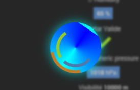
 Il suffit ensuite de sélectionner l’animation depuis la liste du virtuel
  L’animation d’attente Jeedom sera alors celle sélectionnée pour toute la navigation Jeedom.
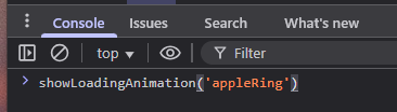
 Il est possible de tester une animation à tout moment depuis le debugger du navigateur (Touche F12) avec la commande suivante depuis la console de debug avec la fonction
 showLoadingAnimation('nomDeLAnimation') :
