Comment utiliser les Plugin HTML

Bonjour a tous le monde
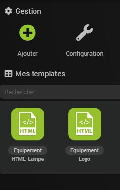
voila le premier exemple un logo de mon jeedom :
Resulta

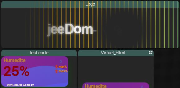
voila une façon d utilise le plugins HTML pour plus d e détaille a venir .


Capture
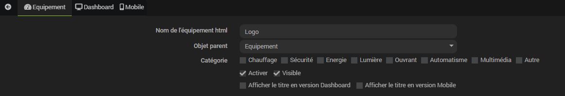
copie le code et le colle dans les deux Dashboard et mobile pour avoir les résulta dans les deux
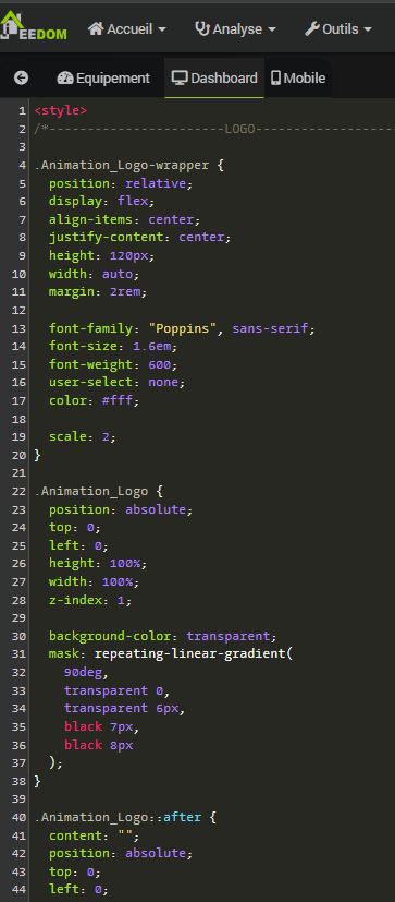

<style>
.Carte_Ambiant {
--f_sizeT: 50px;
 --ColorT : DarkRed;
  background: DarkRed;
  box-shadow: 0px 8px 28px -9px DarkGreen;
  position: relative;
  width: 240px;
  height: 110px;
  border-radius: 16px;
  overflow: hidden;
 transition: all 0.8s cubic-bezier(0.15, 0.83, 0.66, 1);
  cursor: pointer;
}

.Animation_Carte {
  position: absolute;
  width: 540px;
  height: 700px;
  opacity: 0.6;
  left: 0;
  top: 0;
  margin-left: -50%;
  margin-top: -70%;
background: linear-gradient(744deg,#af40ff,#5b42f3 60%,#00ddeb);
 
}
.Animation_Carte:nth-child(2),
.Animation_Carte:nth-child(3) {
  top: 210px;
}

.playing .Animation_Carte {
  border-radius: 40%;
  animation: Animation_Carte 3000ms infinite linear;
}

.Animation_Carte {
  border-radius: 40%;
  animation: Animation_Carte 55s infinite linear;
}

.playing .Animation_Carte:nth-child(2) {
  animation-duration: 4000ms;
}

.Animation_Carte:nth-child(2) {
  animation-duration: 50s;
}

.playing .Animation_Carte:nth-child(3) {
  animation-duration: 5000ms;
}

.Animation_Carte:nth-child(3) {
  animation-duration: 45s;
}

@keyframes Animation_Carte {
  0% {
    transform: rotate(0deg);
  }

  100% {
    transform: rotate(360deg);
  }
}
.IconeAmbiant{
   position: absolute;
  margin-top: 1px;
  margin-left: 210px;
  width: 20px;
  height: 20px;
  z-index: 12;
  animation: clouds 12s infinite;
   animation: IconeAmbiant_Anime 10s ease-in-out infinite;
}

@keyframes IconeAmbiant_Anime {
  0% {
    transform: translateX(0em) translateY(0em);
  }
  25% {
    transform: translateY(-0.5em) translateX(0.5em);
    rotate: -10deg;
  }
  50% {
    transform: translateY(0.5em) translateX(-0.5em);
  }
  75% {
    transform: translateY(-0.75em) translateX(0.5em);
    rotate: 10deg;
  }
  100% {
    transform: translateX(0em) translateY(0em);
  }
}
  
.ValueAmbiant{
 position: absolute;
  left:7px;
  bottom: 20px;
  font-weight: 700;
  font-size: var(--f_sizeT);
  line-height: 77px;
  color:  var(--ColorT);
}
.IconeMin{
  position: absolute;
  margin-top: 30px;
  margin-left: 190px;
  width: 20px;
  height: 20px;
  z-index: 12;
  animation: clouds 12s infinite;
  animation-timing-function: ease-in-out;
}

.ValueMin{
 position: absolute;
 margin-top: 0px;
  margin-left: 205px;
  font-weight: 700;
  font-size:12px;
  line-height: 77px;
  color:  DarkOrange;
}
.IconeMax{
  position: absolute;
  margin-top: 45px;
  margin-left: 190px;
  width: 20px;
  height: 20px;
  z-index: 12;
  animation: clouds 12s infinite;
  animation-timing-function: ease-in-out;
}

.ValueMax{
 position: absolute;
 margin-top: 15px;
  margin-left: 205px;
  font-weight: 700;
  font-size:12px;
  line-height: 77px;
  color:  DarkOrange;
}
.TitreAmbiant{
 position: absolute;
 margin-top: -25px;
  margin-left: 8px;
 font-weight: 700;
  font-size:18px;
  line-height: 77px;
  color:  DarkGoldenRod;
}
  .DateAmbiant{
 position: absolute;
 margin-top: 65px;
  margin-left: 20px;
 font-weight: 700;
  font-size:10px;
  line-height: 77px;
  color:  Cornsilk;
}
</style>

<div class="Carte_Ambiant playing"><div class="image"></div><div class="Animation_Carte"></div><div class="Animation_Carte"></div><div class="Animation_Carte"></div> 
<div class="TitreAmbiant">Humedite</div>
<div class="IconeAmbiant"><img src='https://basmilius.github.io/weather-icons/production/line/all/raindrop.svg'></div>
<div class="ValueAmbiant">25%</div>
<div class="IconeMin"><i class='icon icomoon-arrow-down icon_red'></i></div>
  <div class="ValueMin">min%</div>
<div class="IconeMax"><i class='icon icomoon-arrow-up icon_red'></i></div>
<div class="ValueMax">max%</div>
<div class="DateAmbiant">2025-08-30 24:40:12</div>
</div>

Informations Jeedom

Core : 4.4.19 (master)
DNS Jeedom : non

Plugin : HTML Display
Version : 2025-09-06 01:20:53 (stable)

Désole le code pour le logo

<style>
/*-----------------------LOGO-------------------------------*/ 

.Animation_Logo-wrapper {
  position: relative;
  display: flex;
  align-items: center;
  justify-content: center;
  height: 120px;
  width: auto;
  margin: 2rem;

  font-family: "Poppins", sans-serif;
  font-size: 1.6em;
  font-weight: 600;
  user-select: none;
  color: #fff;

  scale: 2;
}

.Animation_Logo {
  position: absolute;
  top: 0;
  left: 0;
  height: 100%;
  width: 100%;
  z-index: 1;

  background-color: transparent;
  mask: repeating-linear-gradient(
    90deg,
    transparent 0,
    transparent 6px,
    black 7px,
    black 8px
  );
}

.Animation_Logo::after {
  content: "";
  position: absolute;
  top: 0;
  left: 0;
  width: 100%;
  height: 100%;

  background-image: radial-gradient(circle at 50% 50%, #ff0 0%, transparent 50%),
    radial-gradient(circle at 45% 45%, #f00 0%, transparent 45%),
    radial-gradient(circle at 55% 55%, #0ff 0%, transparent 45%),
    radial-gradient(circle at 45% 55%, #0f0 0%, transparent 45%),
    radial-gradient(circle at 55% 45%, #00f 0%, transparent 45%);
  mask: radial-gradient(
    circle at 50% 50%,
    transparent 0%,
    transparent 10%,
    black 25%
  );
  animation:
    transform-animation 2s infinite alternate,
    opacity-animation 4s infinite;
  animation-timing-function: cubic-bezier(0.6, 0.8, 0.5, 1);
}

@keyframes transform-animation {
  0% {
    transform: translate(-55%);
  }
  100% {
    transform: translate(55%);
  }
}

@keyframes opacity-animation {
  0%,
  100% {
    opacity: 0;
  }
  15% {
    opacity: 1;
  }
  65% {
    opacity: 0;
  }
}

.Animation_Logo-letter {
  display: inline-block;
  opacity: 0;
  animation: Animation_Logo-letter-anim 4s infinite linear;
  z-index: 2;
}

.Animation_Logo-letter:nth-child(1) {
  animation-delay: 0.1s;
}
.Animation_Logo-letter:nth-child(2) {
  animation-delay: 0.205s;
}
.Animation_Logo-letter:nth-child(3) {
  animation-delay: 0.31s;
}
.Animation_Logo-letter:nth-child(4) {
  animation-delay: 0.415s;
}
.Animation_Logo-letter:nth-child(5) {
  animation-delay: 0.521s;
}
.Animation_Logo-letter:nth-child(6) {
  animation-delay: 0.626s;
}
.Animation_Logo-letter:nth-child(7) {
  animation-delay: 0.731s;
}
.Animation_Logo-letter:nth-child(8) {
  animation-delay: 0.837s;
}
.Animation_Logo-letter:nth-child(9) {
  animation-delay: 0.942s;
}
.Animation_Logo-letter:nth-child(10) {
  animation-delay: 1.047s;
}

@keyframes Animation_Logo-letter-anim {
  0% {
    opacity: 0;
  }
  5% {
    opacity: 1;
    text-shadow: 0 0 4px #fff;
    transform: scale(1.1) translateY(-2px);
  }
  20% {
    opacity: 0.2;
  }
  100% {
    opacity: 0;
  }
}
/*-----------------------LOGO-------------------------------*/
</style>
<! -- ---------------------LOGO--------------------------- -->
<div class="Animation_Logo-wrapper">
  <span class="Animation_Logo-letter">j</span>
  <span class="Animation_Logo-letter">e</span>
  <span class="Animation_Logo-letter">e</span>
  <span class="Animation_Logo-letter">D</span>
  <span class="Animation_Logo-letter">o</span>
  <span class="Animation_Logo-letter">m</span>
  <span class="Animation_Logo-letter">-</span>
  <span class="Animation_Logo-letter">-</span>
  <span class="Animation_Logo-letter">-</span>
  <span class="Animation_Logo-letter"><img src="https://basmilius.github.io/weather-icons/production/line/all/smoke-particles.svg" width="50" height="50"></span>
  <div class="Animation_Logo"></div>
</div>
<! -- LOGO -->

Le code sur Blocnote
LOGO.txt (3,5 Ko)