Bonjour à tous et aux pros du css 
J’essaie de créer un bouton animé, que j’applique des commandes actions sur un virtuel en disposition de tableau.
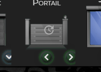
Mon problème est que les boutons sont centrés et décallés à droite. Ni chatgpt, ni Gemini m’ont trouvé la solution.
Quelqu’un a t’il une idée ?
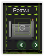
Le visuel
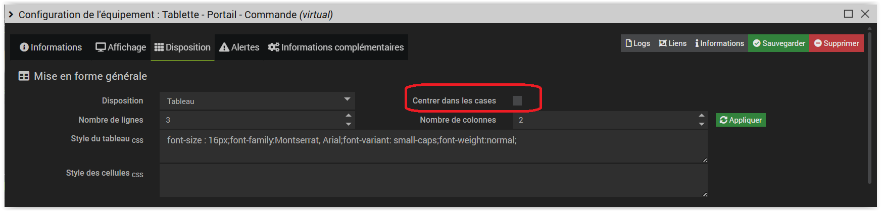
la mise en forme du virtuel
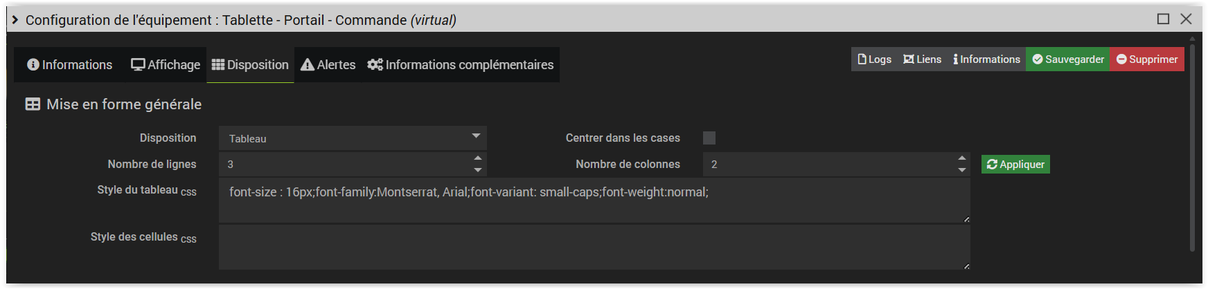
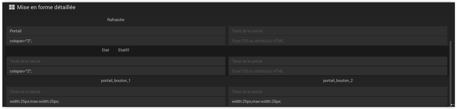
Les options
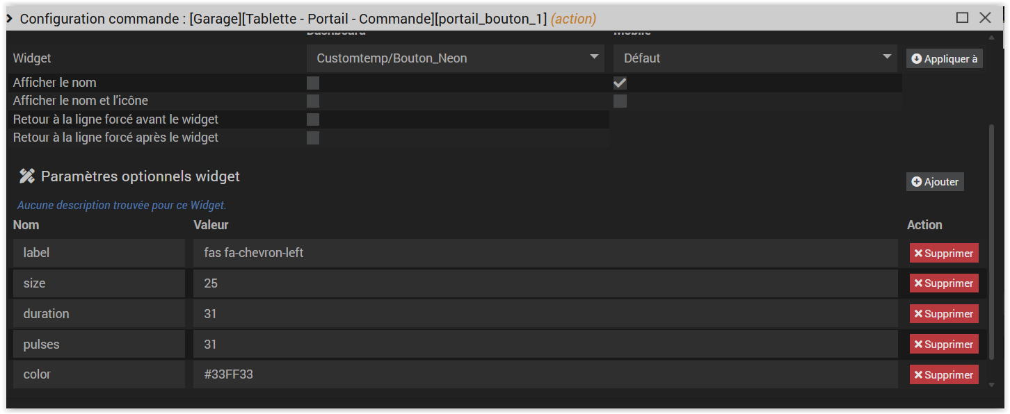
Le code du widget
<div class="cmd cmd-widget cursor neon-button_#uid#" id="neonBtn_#uid#" data-cmdid="#id#" style="min-width: unset;">
    <div class="btn-root" id="btnRoot_#uid#">
        <span class="label" id="btnLabel_#uid#"></span>
        <svg class="ring" viewBox="0 0 100 100">
            <circle class="track" cx="50" cy="50" r="46"/>
            <circle class="path" cx="50" cy="50" r="46"/>
        </svg>
    </div>
</div>

<style>
/* -------------------- STYLE CSS V51 (Base V41) -------------------- */
.neon-button_#uid# {
    display: flex !important;
    align-items: center;
    justify-content: center;
    width: 100% !important;
    height: 100% !important;
    box-sizing: border-box;
    padding: 0 !important;
}

.neon-button_#uid# .btn-root {
    position: relative;
    width: var(--btn-size-clamped, 100px);
    height: var(--btn-size-clamped, 100px);
    border-radius: 50%;
    background: radial-gradient(circle at 30% 30%, #2c3138, #111);
    box-shadow: inset 0 2px 4px rgba(255,255,255,0.1),
                inset -2px -4px 6px rgba(0,0,0,0.5),
                0 0 40px rgba(0,0,0,0.2),
                0 0 25px var(--glow-color, rgba(100,200,255,0.6));
    cursor: pointer;
    overflow: hidden;
    display: flex;
    align-items: center;
    justify-content: center;
    transition: transform 0.12s ease, box-shadow 0.12s ease;
    margin: 0;
}
.neon-button_#uid# .btn-root:active { transform: scale(0.96); }

.neon-button_#uid# .label {
    font-family: Arial, sans-serif;
    font-weight: bold;
    font-size: 20px;
    color: #fff;
    text-shadow: 0 0 6px var(--ring-color, #69d6ff),
                 0 0 12px var(--ring-color, #2fd0ff);
    pointer-events: none;
    z-index: 2;
    display: inline-flex;
    align-items: center;
    line-height: 1;
}
.neon-button_#uid# .label i { line-height: 1; display: inline-block; }

.neon-button_#uid# .ring {
    position: absolute;
    inset: 0;
    transform: rotate(-90deg);
    z-index: 1;
}

.neon-button_#uid# .ring .track {
    fill: none;
    stroke: #444;
    stroke-width: 6;
    stroke-linecap: round;
    opacity: 0.5;
}

.neon-button_#uid# .ring .path {
    fill: none;
    stroke: var(--ring-color, #69d6ff);
    stroke-width: 6;
    stroke-linecap: round;
    stroke-dasharray: 290;
    stroke-dashoffset: 290;
    filter: drop-shadow(0 0 3px #FFFFFF)
            drop-shadow(0 0 15px var(--ring-color, #69d6ff));

    transition: stroke-dashoffset 0s linear;
    animation: none !important;
}
/* -------------------- FIN CSS -------------------- */
</style>

<script>
/* -------------------- DEBUT JAVASCRIPT V51 -------------------- */
(function(){
    var uid = '#uid#';
    var rootContainer = document.getElementById('neonBtn_' + uid);
    var root = document.getElementById('btnRoot_' + uid);
    var label = document.getElementById('btnLabel_' + uid);
    var svgRing = root.querySelector('.ring');
    var path = svgRing.querySelector('.path');
    var track = svgRing.querySelector('.track');
    var cmdId = rootContainer.getAttribute('data-cmdid');
    var defaultTransition = 'transform 0.12s ease, box-shadow 0.12s ease';

    // Récupération des options
    function fromParamOrDefault(token, fallback){
        var v = (token || '').toString().trim();
        if (!v || v === 'undefined' || /^#.*#$/.test(v)) return fallback;
        return v;
    }
    var sizeParam = fromParamOrDefault('#size#', '120');
    var colorParam = fromParamOrDefault('#color#', '#69d6ff');
    var durationParam = parseFloat(fromParamOrDefault('#duration#', '1')) || 1;
    var pulsesParam = parseInt(fromParamOrDefault('#pulses#', '1')) || 1;

    // Calculs de temps
    var fullDurationMs = (durationParam / pulsesParam) * 1000;
    var timeFullMs = fullDurationMs * 0.75;
    var timeEmptyMs = fullDurationMs * 0.25;

    // Initialisation des styles
    var sizePx = parseInt(sizeParam, 10);
    var defaultLabel = '#name_display#'.toString().trim();
    if (defaultLabel === '#name_display#') { defaultLabel = 'START'; }
    var labelParam = fromParamOrDefault('#label#', defaultLabel);
    var ringColor = colorParam;
    var glowColor = colorParam;
    root.style.setProperty('--ring-color', ringColor);
    root.style.setProperty('--glow-color', glowColor + 'AA');

    // Gestion du label
    var labelText = labelParam.toString().trim();
    label.innerHTML = '';
    if (/\bfa-\w+|\bfa[srlb]\b|\bfa\b/.test(labelText)) {
        var i = document.createElement('i');
        var classes = labelText.split(/\s+/).filter(c => c.length > 0);
        classes.forEach(function(cls) { i.classList.add(cls); });
        var hasFamily = classes.some(function(cls) { return /^fa[srlb]$/.test(cls); });
        if (!hasFamily && classes.some(c => c.startsWith('fa-'))) { i.classList.add('fas'); }
        label.appendChild(i);
    } else { label.textContent = labelText; }

    // Gestion de la taille
    if (!isNaN(sizePx) && sizePx >= 20) {
        var clampedSize = Math.max(20, sizePx - 20);
        root.style.setProperty('--btn-size-clamped', clampedSize + 'px');
        var strokeWidth = Math.max(2, Math.round(clampedSize * 0.05));

        path.setAttribute('stroke-width', strokeWidth);
        track.setAttribute('stroke-width', strokeWidth);

        var fontSize = Math.max(12, Math.min(30, clampedSize * 0.16));
        label.style.fontSize = fontSize + 'px';

        var sWhite = clampedSize * 0.03;
        var sDiffuse = clampedSize * 0.15;
        var sGlow = clampedSize * 0.25;

        path.style.filter = `drop-shadow(0 0 ${sWhite}px #FFFFFF)
                             drop-shadow(0 0 ${sDiffuse}px ${ringColor})`;

        var initialBoxShadow = `inset 0 2px 4px rgba(255,255,255,0.1),
                                inset -2px -4px 6px rgba(0,0,0,0.5),
                                0 0 40px rgba(0,0,0,0.2),
                                0 0 ${sGlow}px ${glowColor}AA`;
        root.setAttribute('data-initial-shadow', initialBoxShadow);
        root.style.boxShadow = initialBoxShadow;
    }


    // Gestion des pulses
    var currentPulse = 0;
    var isPulsing = false;

    // V51: Fonction dédiée au battement de coeur (scale 1.01)
    function triggerHeartbeat() {
        var originalShadow = root.getAttribute('data-initial-shadow');
        var heartShadow = `0 0 50px ${glowColor}, ${originalShadow}`;

        var scaleFactor = 1.01; // Battement très subtil

        // 1. Battement (Zoom avant)
        root.style.transition = 'transform 0.15s ease-out, box-shadow 0.15s ease-out';
        root.style.transform = `scale(${scaleFactor})`;
        root.style.boxShadow = heartShadow;

        // 2. Retour (Zoom arrière)
        setTimeout(() => {
            root.style.transition = 'transform 0.25s ease-in, box-shadow 0.25s ease-in';
            root.style.transform = 'scale(1)';
            root.style.boxShadow = originalShadow;

            // 3. Réinitialiser la transition par défaut
            setTimeout(() => {
                root.style.transition = defaultTransition;
            }, 300);
        }, 150);
    }

    // Nettoyage après l'animation
    function finalizePulse() {
        path.style.transitionDuration = '0s';
        path.style.strokeDashoffset = 290;
        isPulsing = false;
        root.style.pointerEvents = 'auto';
        path.style.transitionTimingFunction = 'linear';
    }


    function startPulseCycle() {
        if (currentPulse >= pulsesParam) {
            finalizePulse();
            return;
        }

        currentPulse++;

        // Définir la transition pour le remplissage
        path.style.transitionDuration = (timeFullMs / 1000) + 's';
        path.style.transitionTimingFunction = 'ease-in-out';
        path.style.strokeDashoffset = 290;

        setTimeout(function() {
            path.style.strokeDashoffset = 0; // Fin du remplissage

            setTimeout(function() {
                // Déclenchement du battement de cœur après le remplissage de CHAQUE tour
                triggerHeartbeat();

                // Réinitialiser la transition pour le vidage instantané
                path.style.transitionDuration = '0s';
                path.style.transitionTimingFunction = 'linear';

                if (currentPulse < pulsesParam) {
                    path.style.strokeDashoffset = 290; // Réinitialise l'anneau
                    setTimeout(startPulseCycle, timeEmptyMs);
                } else {
                    finalizePulse();
                }
            }, timeFullMs);
        }, 10);
    }

    root.addEventListener('click', function(ev){
        if (isPulsing) return;

        // 1. Exécution de la commande Jeedom
        if (cmdId && typeof jeedom !== 'undefined' && jeedom.cmd && typeof jeedom.cmd.execute === 'function') {
            jeedom.cmd.execute({ id: cmdId });
        }

        // 2. Préparation
        currentPulse = 0;
        isPulsing = true;

        path.style.transitionDuration = '0s';
        path.style.transitionTimingFunction = 'linear';
        path.style.strokeDashoffset = 290;
        root.style.pointerEvents = 'none';

        // 3. Lancement du cycle
        startPulseCycle();
    });

})();
/* -------------------- FIN JAVASCRIPT -------------------- */
</script>
Merci !
Frédéric