Bonjour à tous,
Sur mon design, j’affiche un cadre html avec ce code.
<!-- PRINCIPALE -->
<div style="
width:100%;
box-shadow: 2px 2px 10px rgba(0, 0, 0,1);">
<!-- BANDEAU -->
<div align=center style="color:rgba(0,0,0,1);
font-size:20px;
height:24px;
background-color: rgba(0, 0, 0,1);
padding-top:-1px;
background-color: rgba(0, 0, 0,1);
"
></div> <!-- BANDEAU -->
<!-- TEXTE TITRE -->
<div align=center style="color:rgba(255,255,255,1);
font-size:24px;
height:24px;
background-color: transparent! ;
margin-top:-30px;
font-family:Unica One;
font-weight:normal;
text-shadow: 0px 0px 6px #000000; "
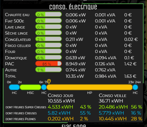
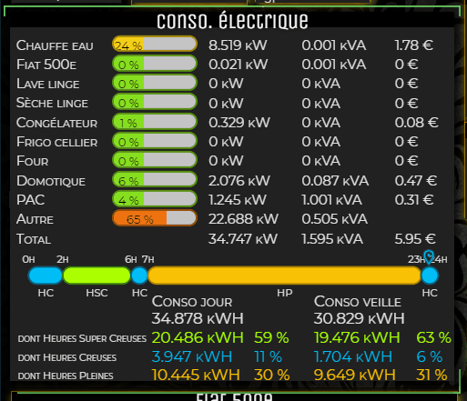
>Conso. électrique</div> <!-- TEXTE TITRE -->
<!-- CONTENU -->
<div style="height:420px; background-color: rgba(33,33,33,1); "> <!-- Modifiez height pour régler la hauteur du cadre -->
</div>
</div>
J’aimerai y amener un peu de vie en y intégrant cette animation (uniquement la partie tournante, pas celle au survol) https://codepen.io/Rplus/pen/abPLGx
Un pro du CSS serait-il l’adapter afin de pouvoir l’utiliser dans Jeedom ?
Merci !
 pour width: 610px; height: 440px;